
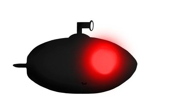
This sprint I was tasked with making a “death” or “losing” sprite of our submarine, for when it has been hunted down by the giant fish. I decided to go for three different aproaches but with the same teqnicues. I choosed the same brushes and decided to go with a theme of red- to symbolise and communicate danger.
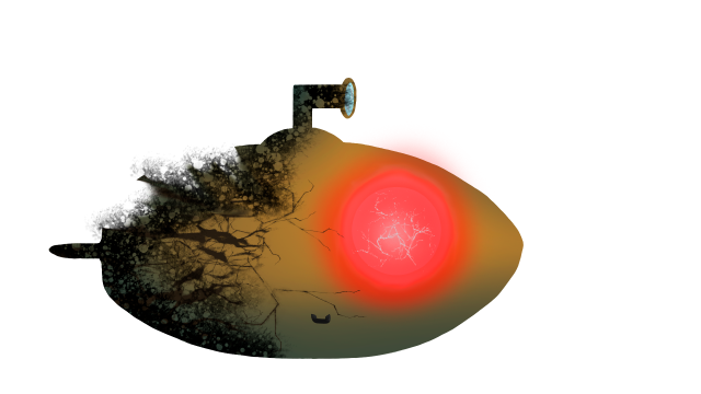
It boiled down to these three concepts, one where I black out all the colour of the submarine and replace the blue light, coming from the glass window – to an alarming red light. I was thinking about the “alarm-lights” coming on inside the submarine, hence why the windows glow red (in both the black, first version and in the yellow, broken, second version.)
But in the second version I imagined the submarine being broken by the giant fish´s bite. I let it crack open and the fuel leak out, covering the cracks and the surrounding water. I also let the main window crack, highlighting with blue cracks to show that it´s still glass breaking. (eventhough the lights are red.)
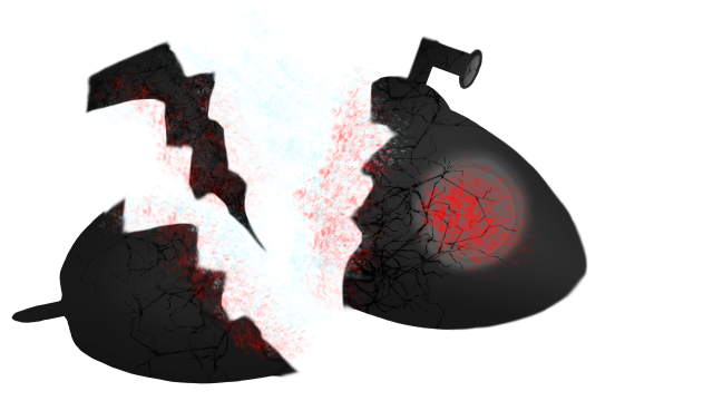
In the third version i combined the best of the both previous designs, yet adding more effects and a more dramatic look to it. I`m especieally pleased with the third one since I worked with blurring out some details to give some extra highlights to other more important things going on in the design. This made it feel like it was in mid-animation, like it was a stillframe from a spritesheet, eventhough it was never meant to be animated! It gave depth and more of a story, with the different parts floating away from eachother. The overall design has the shape of a triangle, with the cracked part at the top, making the triangle heavy on the downparts- giving you the illusion that those parts are heavier and therefore sinks faster than the small part.
My team still can´t decide which one they liked the best, and which one to implement, but we shall see when beta comes along! I am personally voting for the third version, but many of my teammembers vote for the second version. We are going to have a design meeting later this week and then we will decide, hoping everything will tie together for beta presentation!

Hello Hannita!
I really liked the three submarines you designed. I think my favorites are the second and the third, however in my opinion, I would mix them. I liked the second one, mostly because of the colors, but also because I can easily see what you meant with the window cracks being blue and the red light, it looks amazing! The third one definitely looks like it’s telling a story, and I love that, however at first glance, I couldn’t tell that the gray and red circle was the window! So basically I personally would put the second window on the third, if you know what I mean.
As for improvements on the blog post, I would’ve liked to read more about your design choices. Why did you make a yellow submarine? Why is the submarine broken in the middle? Is there a reason behind them looking like glass submarines (which look amazing)? I don’t know, I finished reading feeling like I wanted more. Also, maybe adding a picture of the current submarine, to compare your death images with the submarine and see a bit of the process behind the design.
Anyway, great work! I love the submarines 🙂
Ana Laura Martinez
LikeLiked by 1 person
Thank you gurl! I`ll show you later haha! 😛
LikeLike
Greetings Hanna,
(William Teurnell, Team Poltergeist)
I enjoy the effects you are reaching for. You go into good detail on your thoughts and processes, and your decisions are clearly motivated. You explain the impact and intended meaning of your visuals, and you let the reader know of its significance. It was interesting how you recognised and worked around the fact that there was no animation by creating a sprite that appears caught-in-motion. I liked the end result for this reason; it looks dramatic. I was part of the group that made this concept, and therefore I know well the aesthetics of the game. However, some readers may not. Perhaps it could be in order to touch somewhat upon the core aesthetics of your product so the reader has some sense of context. This would also give you substance to go into why a dramatic, mid-motion, type of sprite is appropriate.
Keep up the good work – it’s fun to see one’s concept brought into existence.
William
LikeLiked by 1 person
And a link to my own post, in case that is needed by someone, somewhere
https://wordpress.com/post/wite5738.wordpress.com/38
LikeLike
Thank you William! 🙂
I will think of that next time!
I`m glad you enjoyed it!
Hanna
LikeLike
Hi Hanna,
I know i should probably comment on Clement’s blog since i am a programmer but since it’s your group i just couldn’t not comment on yours instead.
First off, i love the theme of your blog it is very dark and mysterious which makes your groups game “Depth” really shine through. I don’t know if you did that on purpose, but it is awesome! especially since it was my group that came up with the “Depth” concept.
Ok so enough about your theme, let’s take a look at your actual blog post. I like that when you describe what you’ve been working on, you give us a tad bit of your thought process when it comes to creating sprites and we can derive that you have a similar thought process for other sprites you have made. I also like that with all three of your concepts for your “death” sprite, you use the same brushes, this is good art practise because it links art pieces together with a specific theme and if having done different brushes the concepts would be too different and might look contextually weird.
The production process for the creation of your 3 sprites is very clearly described which makes the reader read your text more intuitively. Your motivation for your production process is also very good and i can really see why you chose to go with those specific colour schemes and scenes. This blog post really provides value to readers who are looking for motivations or ideas for creating sprites with a theme of death.
Lastly, in terms of can your post be improved, all i say is that in some places it feels like you just shoved in information where more information wasn’t necessary since in the next paragraph you end up talking about that subject anyways. You did this in here: “I was thinking about the “alarm-lights” coming on inside the submarine, hence why the windows glow red (in both the black, first version and in the yellow, broken, second version.)” The information in brackets wasn’t necessary in my opinion. Other than that, i really enjoyed this blog post, i also like your art style and can’t wait for the final version of your game!
– Natasha Bianca Mangan
LikeLiked by 1 person
Thank you Tash!
I see what you mean, and I will think of it to the next blog!
I´m very pleased that you enjoyed it! 🙂
Hanna
LikeLike